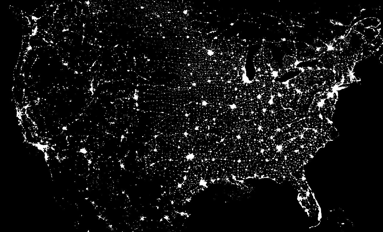
I've previously mentioned the shortest splitline algorithm for determining congressional districts in the United States. (This could work in other districting situations, as well.) The algorithm breaks states into districts by breaking them up along the shortest possible lines; for a more thorough description see this.
Well, today I got an e-mail from the good people at rangevoting.org saying that they now had computer-generated maps of their algorithm's redistrictings for all fifty states. These, I assume, supercede their approximate sketches
I'm not entirely sure how good an idea this particular redistricting algorithm is. Basically, assuming that straight lines are the right way to break things up seems to imply that all directions should be treated equally, when actual settlement patterns aren't isotropic. But the beauty of any algorithm which doesn't include any "tunable" parameters -- of which this is an example -- is that there is zero possibility of gerrymandering. If we imagine an algorithm that takes into account "travel time" between points, for example, instead of as-the-crow-flies distance, then how do you define travel time? And next thing you know, you'll see new roads getting built because of how you'd expect them to change congressional districting. As-the-crow-flies distance along the surface of the earth doesn't have these issues.
Not surprisingly, the people at rangevoting.org also support something called range voting, which would basically allow people to give scores to candidates in an election, and the candidate with the highest scores would win. I haven't much thought about it, but it seems like a good idea. And here's their page for mathematicians!
Showing posts with label maps. Show all posts
Showing posts with label maps. Show all posts
02 December 2007


19 October 2007
The chain of cities
From radical cartography -- a map of Europe with cities that are near each other (within 150 km) and with populations of more than 100,000 connected by lines. In some places (southern England, the Netherlands, Germany, northern Italy) the lines are very dense; in others they are not. The graph has one large connected component, but there are smaller components -- in Scotland, southern Italy, and the coasts of Spain -- which are separate from the main one.
I suspect you'd get similar-looking maps at smaller scales (that is, if you reduced both the population threshold and the distance threshold). I've heard that the number of cities of population at least N scales like 1/N. To get a similar-looking map with smaller cities you'd want the number of cities "near" each one to be the same. So, for example, say you looked at cities of size 25,000 or greater; there should be four times as many of those "near" a given point as cities of size 100,000 or greater. If we then shorten the distances over which we're willing to draw lines by a factor of two, then we should get the same average degree in the resulting graph. What I'm saying is that I suspect the graph of cities of size 25,000 or greater within 75 km of each other has similar qualitative features. (Of course, at some point you run into the problem of how to define distinct "cities", by which I mean centers of population; should distinct neighborhoods of the same legal municipality be counted differently?)
I'd be interested to see a similar map for the United States (since I'm more familiar with the settlement patterns in the U.S. than in Europe), but not interested enough to make it.
In particular, I see a lot of things that look like the fragments of triangular lattices, with the triangles involved being roughly equilateral. (This seems most visible in Poland.) Now, if you imagine cities as circles -- which isn't a horrible approximation, because you don't expect to see two cities too close to each other -- and you pack them in as tightly as possible on the plane, you should see exactly a hexagonal lattice. Of course, cities aren't all equivalent, and you can't just slide them around arbitrarily...
This makes me wonder -- are there any cities which have street plans that are triangular lattices?
I suspect you'd get similar-looking maps at smaller scales (that is, if you reduced both the population threshold and the distance threshold). I've heard that the number of cities of population at least N scales like 1/N. To get a similar-looking map with smaller cities you'd want the number of cities "near" each one to be the same. So, for example, say you looked at cities of size 25,000 or greater; there should be four times as many of those "near" a given point as cities of size 100,000 or greater. If we then shorten the distances over which we're willing to draw lines by a factor of two, then we should get the same average degree in the resulting graph. What I'm saying is that I suspect the graph of cities of size 25,000 or greater within 75 km of each other has similar qualitative features. (Of course, at some point you run into the problem of how to define distinct "cities", by which I mean centers of population; should distinct neighborhoods of the same legal municipality be counted differently?)
I'd be interested to see a similar map for the United States (since I'm more familiar with the settlement patterns in the U.S. than in Europe), but not interested enough to make it.
In particular, I see a lot of things that look like the fragments of triangular lattices, with the triangles involved being roughly equilateral. (This seems most visible in Poland.) Now, if you imagine cities as circles -- which isn't a horrible approximation, because you don't expect to see two cities too close to each other -- and you pack them in as tightly as possible on the plane, you should see exactly a hexagonal lattice. Of course, cities aren't all equivalent, and you can't just slide them around arbitrarily...
This makes me wonder -- are there any cities which have street plans that are triangular lattices?
18 October 2007
Un-Austria, and some thoughts on population density
Strange Maps brings us a map of Un-Austria, originally due to Babak Fakhamzadeh. The purpose of this map is to illustrate certain statistics about the Austrian people by associating those groups of people with parts of a map; seven percent of Austrians are "not proud of their nationality" and so an area roughly one-fourteenth of the size of Austria is marked as such.
It's an interesting concept, but I see problems with it. First, it gives the impression that people who are in one of the marked groups aren't in any of the others; this isn't true. (In the most extreme case, shouldn't "members of voluntary environmental organizations" be contained entirely within "members of voluntary organizations"?) Second, although I have no concept of the geography of Austria, I'm sure there are parts of it that are more populated than other parts, and I wonder if the map creates false impressions for those people who actually do live in Austria. (For an American example, New Jersey makes up one part in 434 of the land of the United States. Yet one in thirty-four Americans live in New Jersey. I am aware of this, so if someone associated the land making up New Jersey with some one-in-434 subset of Americans, I might get confused. On the other extreme, Carbon County, Wyoming has about the same area, but only about one in twenty thousand Americans lives there. My point is that most people living in a given country probably have some rough idea of how population density in the country is spread out; I suspect that the way they would "intuitively" interpret a map such as this one takes this into account, but not perfectly. (If I had to guess, the population we intuitively perceive to be in a region of a map such as this one is proportional to the integral of the square root of population density, although I just made that up; it somehow seems appealing that we would perceive an area that's actually four times as dense as another to be two times as dense, because that seems to point to some sort of idea of "linear density". Please ignore the fact that the units here don't work.)
It's an interesting concept, but I see problems with it. First, it gives the impression that people who are in one of the marked groups aren't in any of the others; this isn't true. (In the most extreme case, shouldn't "members of voluntary environmental organizations" be contained entirely within "members of voluntary organizations"?) Second, although I have no concept of the geography of Austria, I'm sure there are parts of it that are more populated than other parts, and I wonder if the map creates false impressions for those people who actually do live in Austria. (For an American example, New Jersey makes up one part in 434 of the land of the United States. Yet one in thirty-four Americans live in New Jersey. I am aware of this, so if someone associated the land making up New Jersey with some one-in-434 subset of Americans, I might get confused. On the other extreme, Carbon County, Wyoming has about the same area, but only about one in twenty thousand Americans lives there. My point is that most people living in a given country probably have some rough idea of how population density in the country is spread out; I suspect that the way they would "intuitively" interpret a map such as this one takes this into account, but not perfectly. (If I had to guess, the population we intuitively perceive to be in a region of a map such as this one is proportional to the integral of the square root of population density, although I just made that up; it somehow seems appealing that we would perceive an area that's actually four times as dense as another to be two times as dense, because that seems to point to some sort of idea of "linear density". Please ignore the fact that the units here don't work.)
24 September 2007
redistricting redux
At Statistical Modeling, etc. I learned about Roland Fryer and Richard Holden's Measuring the Compactness of Political Districting Plans, which is a nice mixture of political science and mathematics. (I've talked about redistricting before, here and here.) A nice thing about this paper is that they show their results in an arbitrary metric space -- working in Euclidean space seems kind of limiting because distances in "real life" aren't Euclidean. Sometimes you can't get there from here. Or sometimes you can but no one ever does.
The authors define a "relative proximity index" for a districting plan of a state. First they define an absolute proximity index (they don't use this name, as far as I can see) as the square of the distances between voters, summed over all pairs of voters who are in the same district. Then the relative proximity index is this index measured on a scale where its minimum over all possible districtings of a state is 1. (A districting is a partition of the people in a state into n sets which differ in size by at most 1.)
The main result is that the RPI is an example of a "compactness index", which should satisfy three axioms: anonymity (if you interchange people, the index doesn't change), something called "clustering", and "independence" (which means that a compactness index doesn't vary if the size, population density, or number of districts in a state changes, holding all else constant). It turns out that if one districting plan is better than another under RPI, that relation will also hold under any other compactness index.
This paper also wins the prize for "biggest number I've seen that actually means something". The number of ways to partition the 6,800 census tracts of California into 53 districts is 78.4 × 1059,351. (I was about to write "about 1060,000", despite the fact that these numbers differ by a factor of more than 10647... the fact that I'm willing to throw out such a large factor tells you just how large a number this is!) This is the size of the search spaces they have to consider.
(I don't pretend to understand the details... I've only skimmed the paper.)
The authors define a "relative proximity index" for a districting plan of a state. First they define an absolute proximity index (they don't use this name, as far as I can see) as the square of the distances between voters, summed over all pairs of voters who are in the same district. Then the relative proximity index is this index measured on a scale where its minimum over all possible districtings of a state is 1. (A districting is a partition of the people in a state into n sets which differ in size by at most 1.)
The main result is that the RPI is an example of a "compactness index", which should satisfy three axioms: anonymity (if you interchange people, the index doesn't change), something called "clustering", and "independence" (which means that a compactness index doesn't vary if the size, population density, or number of districts in a state changes, holding all else constant). It turns out that if one districting plan is better than another under RPI, that relation will also hold under any other compactness index.
This paper also wins the prize for "biggest number I've seen that actually means something". The number of ways to partition the 6,800 census tracts of California into 53 districts is 78.4 × 1059,351. (I was about to write "about 1060,000", despite the fact that these numbers differ by a factor of more than 10647... the fact that I'm willing to throw out such a large factor tells you just how large a number this is!) This is the size of the search spaces they have to consider.
(I don't pretend to understand the details... I've only skimmed the paper.)
14 September 2007
Yet another Congressional redistricting proposal
Yet another Congressional redistricting proposal, from Brian Olson.
This proposal is based on the theory that the "best" districting proposal is the one which has the shortest sum of distances from people to the center of their districts.
It sounds like a good idea, but I'm not sure how one would actually find this. Olson claims to. But his program runs by taking the current districting and perturbing it (he has video showing this), which means that the maps look like the current maps. Gerrymandering becomes a bit more difficult because you can't have districts that are oddly shaped. But, for example, the city of Austin, Texas (with a population which is very nearly that of one congressional district, and is politically quite different from the surrounding areas) is shared between three districts in both the old and new maps.
Of course, Olson's method didn't say it wouldn't do that, and in fact Olson addresses the question of his method breaking up communities in his FAQ. But I also wonder if he's only finding a local minimum for the sum of the distance to the centers, while the global minimum might lie with a map that looks radically different. The space of possible districtings of a state is very-high-dimensional so this is the sort of thing one has to worry about. Olson in fact proposes an Impartial Redistricting Amendment which would enshrine this criterion -- but how do we know that his program, or any other program, actually implements it?
What might be interesting is to just assign each census block in a state to a district at random and then run the algorithm. The problem with that is that there's no way the district lines would end up falling in the same place every time.
(Found at O'Reilly Radar, via Statistical Modeling, etc., the full name of which I'm tired of typing.)
This proposal is based on the theory that the "best" districting proposal is the one which has the shortest sum of distances from people to the center of their districts.
It sounds like a good idea, but I'm not sure how one would actually find this. Olson claims to. But his program runs by taking the current districting and perturbing it (he has video showing this), which means that the maps look like the current maps. Gerrymandering becomes a bit more difficult because you can't have districts that are oddly shaped. But, for example, the city of Austin, Texas (with a population which is very nearly that of one congressional district, and is politically quite different from the surrounding areas) is shared between three districts in both the old and new maps.
Of course, Olson's method didn't say it wouldn't do that, and in fact Olson addresses the question of his method breaking up communities in his FAQ. But I also wonder if he's only finding a local minimum for the sum of the distance to the centers, while the global minimum might lie with a map that looks radically different. The space of possible districtings of a state is very-high-dimensional so this is the sort of thing one has to worry about. Olson in fact proposes an Impartial Redistricting Amendment which would enshrine this criterion -- but how do we know that his program, or any other program, actually implements it?
What might be interesting is to just assign each census block in a state to a district at random and then run the algorithm. The problem with that is that there's no way the district lines would end up falling in the same place every time.
(Found at O'Reilly Radar, via Statistical Modeling, etc., the full name of which I'm tired of typing.)
31 August 2007
how maps are like mathematics, and maps of mathematics
Yesterday I wrote about different ways of drawing the Interstate highway system, and introduced this map by Nat Case that clearly shows it as a grid. Case had written about the map at Map Head, and says there that people accused him of copying this map by Chris Yates.
Apparently some people aren't happy about Case's map, because they're claiming that Case just ripped off Yates' idea. I don't know anything about intellectual property law, but it seems to me that there are a lot of maps of the same area that look very similar and convey almost the same information -- maps that are much more similar than those of Case and Yates. For example, two ordinary road maps of the same area should look very similar, because they'll depict the same roads! The impression I have is that the information (where the roads are) is freely available but the particular way in which it's drawn (if this isn't just a simple transcription of the information) is not. To quote one of the commenters here:
To this I would add that mathematics works the same way. Most proofs of the same mathematical fact, most expositions of the same concept, etc. will look the same in outline, simply because they have to respect how the ideas stand in logical relation to each other. But the choice of notation, of words to go between the equations explaining what's going on, and so on is unique to each author, and probably has a lot to do with what else is going on in a particular book or article. One might choose to emphasize certain parts of a proof -- doing some simple algebra in full instead of just saying "the reader can verify this" -- because the same calculation will come in handy later. Notation seems analogous to graphic design elements like color; a good map uses colors which are clearly different for things which are different, and good notation does the same. (I've had professors who used a and α, u and μ, or v and ν in the same problem, and had bad handwriting. No! I'd even go so far as to say that using letters which look similar in typed work is bad practice, because the conscientious reader will be copying your notation by hand in order to check things.) I doubt there are two proofs out there of, say, the Fundamental Theorem of Calculus (to take a result that's been reproduced in a zillion textbooks) that are word-for-word and symbol-for-symbol the same, just like there probably aren't two maps of Manhattan that are pixel-for-pixel the same.
The point here is that there's good exposition and bad exposition, which coincide roughly with good maps and bad maps. A good map, or a good writer, will help you navigate a tricky area; a bad map will just confused you.
And what would a map of mathematics itself look like? Dave Rusin has given it a shot, but each area of mathematics is just a circle to him, and it's not clear to me how they're connected to each other, or why his circles are arranged the way they are. He says at his A Gentle Introduction to the Mathematics Subject Classification Scheme that "[t]he welcome page for this site shows an image of the areas of mathematics which shows the relative numbers of recent papers in each area (arranged so as to illustrate the affinities among related areas)." It's a decent job -- nothing seems too far from where it should be, and I imagine that projecting the whole thing down into two dimensions makes it quite difficult! -- and it's not just based on Rusin's prejudices. It seems to come from correlations between classifications in that scheme -- two classifications are "close together" if there are papers which are classified in both of them. This somehow gives rise to a 61-dimensional space (the 61 dimensions presumably corresponding to the 61 two-digit classes in that scheme) of which this map is a two-dimensional projection. The vertical direction seems to work out with "discrete" mathematics at the top and "continuous" mathematics at the bottom; I'm not sure what the horizontal direction represents. (I think one could make an argument for "pure" on the left versus "applied" on the right, but it's a weak one.)
The same can be done with individual papers, or with mathematicians; see, for example, the papers of eight Fields medalists.
I sense that more could be done. Which areas of mathematics do you need to learn before learning certain others? Which areas historically grew out of each other? Within an area, how are the important results related to each other? And how could this be illustrated pictorially? I'm not sure what good this would be, though.
(At least two people seem to have done something similar for motorways in England); not surprisingly they both did their maps in the style of the London Underground map. It probably won't surprise you to learn that Great Britian's road numbering scheme isn't a grid, but rather divides England and Wales into zones emanating from London, and Scotland into zones emanating from Edinburgh.)
Apparently some people aren't happy about Case's map, because they're claiming that Case just ripped off Yates' idea. I don't know anything about intellectual property law, but it seems to me that there are a lot of maps of the same area that look very similar and convey almost the same information -- maps that are much more similar than those of Case and Yates. For example, two ordinary road maps of the same area should look very similar, because they'll depict the same roads! The impression I have is that the information (where the roads are) is freely available but the particular way in which it's drawn (if this isn't just a simple transcription of the information) is not. To quote one of the commenters here:
Copyright law expressly does NOT apply to "ideas", only to the execution of ideas. If this dude had copied the colors, font, or any other specific element from Chris' map, then it would be a different story (and "straight lines" isn't quite a specific element). If he had made his own map look like a subway map, even then it might have been a fuzzy area.
But, what seems to have happened was that he looked at Chris' map, then started from scratch creating his own expression of a similar idea. While it may have been courteous for him to credit Chris for the inspiration more obviously than he did, he certainly isn't legally required to do so. In fact, this very process of re-interpreting others' work is basically how art progresses in society in general. To use your analogy, I think this guy looked at a Picasso, said, "Hmm, cubism is cool," and painted his own cubist painting of the same model that Picasso used.
To this I would add that mathematics works the same way. Most proofs of the same mathematical fact, most expositions of the same concept, etc. will look the same in outline, simply because they have to respect how the ideas stand in logical relation to each other. But the choice of notation, of words to go between the equations explaining what's going on, and so on is unique to each author, and probably has a lot to do with what else is going on in a particular book or article. One might choose to emphasize certain parts of a proof -- doing some simple algebra in full instead of just saying "the reader can verify this" -- because the same calculation will come in handy later. Notation seems analogous to graphic design elements like color; a good map uses colors which are clearly different for things which are different, and good notation does the same. (I've had professors who used a and α, u and μ, or v and ν in the same problem, and had bad handwriting. No! I'd even go so far as to say that using letters which look similar in typed work is bad practice, because the conscientious reader will be copying your notation by hand in order to check things.) I doubt there are two proofs out there of, say, the Fundamental Theorem of Calculus (to take a result that's been reproduced in a zillion textbooks) that are word-for-word and symbol-for-symbol the same, just like there probably aren't two maps of Manhattan that are pixel-for-pixel the same.
The point here is that there's good exposition and bad exposition, which coincide roughly with good maps and bad maps. A good map, or a good writer, will help you navigate a tricky area; a bad map will just confused you.
And what would a map of mathematics itself look like? Dave Rusin has given it a shot, but each area of mathematics is just a circle to him, and it's not clear to me how they're connected to each other, or why his circles are arranged the way they are. He says at his A Gentle Introduction to the Mathematics Subject Classification Scheme that "[t]he welcome page for this site shows an image of the areas of mathematics which shows the relative numbers of recent papers in each area (arranged so as to illustrate the affinities among related areas)." It's a decent job -- nothing seems too far from where it should be, and I imagine that projecting the whole thing down into two dimensions makes it quite difficult! -- and it's not just based on Rusin's prejudices. It seems to come from correlations between classifications in that scheme -- two classifications are "close together" if there are papers which are classified in both of them. This somehow gives rise to a 61-dimensional space (the 61 dimensions presumably corresponding to the 61 two-digit classes in that scheme) of which this map is a two-dimensional projection. The vertical direction seems to work out with "discrete" mathematics at the top and "continuous" mathematics at the bottom; I'm not sure what the horizontal direction represents. (I think one could make an argument for "pure" on the left versus "applied" on the right, but it's a weak one.)
The same can be done with individual papers, or with mathematicians; see, for example, the papers of eight Fields medalists.
I sense that more could be done. Which areas of mathematics do you need to learn before learning certain others? Which areas historically grew out of each other? Within an area, how are the important results related to each other? And how could this be illustrated pictorially? I'm not sure what good this would be, though.
(At least two people seem to have done something similar for motorways in England); not surprisingly they both did their maps in the style of the London Underground map. It probably won't surprise you to learn that Great Britian's road numbering scheme isn't a grid, but rather divides England and Wales into zones emanating from London, and Scotland into zones emanating from Edinburgh.)
30 August 2007
ways of drawing the Interstate Highway System
Earlier this year, Chris Yates made available online a simplified map of the Interstate highway system, where the interstates are for the most part straight lines. This made its way around the Internet for a while, and it was frequently pointed out that it was wrong -- certain interstates just aren't on it. (The ones I noticed were I-83 (which runs between Harrisburg and Baltimore) and I-88 (Albany to Binghamton); a lot of other people pointed out that it also omits the entire state of Wisconsin.)
It occurred to me that it would be nice to see this map done correctly, and I'm trying to do it myself; unfortunately I don't have a really big piece of paper! It's probably possible to represent all the two-digit Interstates on a single piece of paper, though. But this map from Hedberg Maps looks like what I was thinking of -- it basically assumes that as many of the two-digit Interstates as possible actually form a grid and then fills in the rest, including the three-digit Interstates, accordingly. Too bad it's $40. They explain how the map works here; basically, the map's author, Nat Case, attempted to respect the topology of the system and align the main roads of the system with the grid, so the distance between, say, I-70 and I-80 is the same as the distance between I-80 and I-90. (Case claims inspiration from Yates' map, but seems to be a lot less visible on the Internet, probably because you can't view it online.)
A lot of people compare these to "subway maps", but there's one big difference. On a map of a subway system, the various subway lines are generally denoted by different colors; this makes it obvious when one has to transfer from one line to another. (See, for example, the standard Washington Metro map; there's a recolored version of the map to indicate the different service patterns they run on July 4th.) And this makes sense, because a change of trains has a substantial cost -- you've got to get off the train, often walk up or down some steps, and wait for another train to come. Roads don't work like that -- the cost to go from one highway to another is minimal.
I'd also like to see a similar map of, say, Philadelphia; the street signs indicate that each intersection is a certain distance west or east of one axis (Front Street or Germantown Avenue, depending on location) and north or south of another (Market Street), but the grid breaks down the further you get from the historic city. I actually live along a "seam" in this grid; as you walk down my street the numbers immediately go from the 500s to the 900s. How is the map distorted if you try to place locations not where they are, but where the addressing system implies they are?
edited: Nat Case talks about the map at mapHead; you can see a larger version of the map here. (1080 by 1080, which is large enough to get a very good idea what's going on. It's particularly interesting how some of the shapes of states get distorted here -- Florida is now much longer east-west than north-south, for example, and Arizona and New Mexico end up having roughly the shape of Chile, and Illinois is huge.
Personally, I think it's a little crowded in the northeast, which is something you might not necessarily expect from the description.
And now I don't have to make this map myself to see what it looks like, which is a relief because I'm not particularly good at this sort of thing.
It occurred to me that it would be nice to see this map done correctly, and I'm trying to do it myself; unfortunately I don't have a really big piece of paper! It's probably possible to represent all the two-digit Interstates on a single piece of paper, though. But this map from Hedberg Maps looks like what I was thinking of -- it basically assumes that as many of the two-digit Interstates as possible actually form a grid and then fills in the rest, including the three-digit Interstates, accordingly. Too bad it's $40. They explain how the map works here; basically, the map's author, Nat Case, attempted to respect the topology of the system and align the main roads of the system with the grid, so the distance between, say, I-70 and I-80 is the same as the distance between I-80 and I-90. (Case claims inspiration from Yates' map, but seems to be a lot less visible on the Internet, probably because you can't view it online.)
A lot of people compare these to "subway maps", but there's one big difference. On a map of a subway system, the various subway lines are generally denoted by different colors; this makes it obvious when one has to transfer from one line to another. (See, for example, the standard Washington Metro map; there's a recolored version of the map to indicate the different service patterns they run on July 4th.) And this makes sense, because a change of trains has a substantial cost -- you've got to get off the train, often walk up or down some steps, and wait for another train to come. Roads don't work like that -- the cost to go from one highway to another is minimal.
I'd also like to see a similar map of, say, Philadelphia; the street signs indicate that each intersection is a certain distance west or east of one axis (Front Street or Germantown Avenue, depending on location) and north or south of another (Market Street), but the grid breaks down the further you get from the historic city. I actually live along a "seam" in this grid; as you walk down my street the numbers immediately go from the 500s to the 900s. How is the map distorted if you try to place locations not where they are, but where the addressing system implies they are?
edited: Nat Case talks about the map at mapHead; you can see a larger version of the map here. (1080 by 1080, which is large enough to get a very good idea what's going on. It's particularly interesting how some of the shapes of states get distorted here -- Florida is now much longer east-west than north-south, for example, and Arizona and New Mexico end up having roughly the shape of Chile, and Illinois is huge.
Personally, I think it's a little crowded in the northeast, which is something you might not necessarily expect from the description.
And now I don't have to make this map myself to see what it looks like, which is a relief because I'm not particularly good at this sort of thing.
10 August 2007
the traffic.com "Jam Factor"
Traffic.com has something they refer to as the "Jam Factor" to tell you how much traffic there is on various major roads in your area. It's an apparently arbitrary number from 0 to 10.
Now, if I see that the jam factor is 3.1 right now, what does that mean? How long is it going to take me to get where I'm going?
They claim:
If you click on the name of any segment of road, it'll tell you how long it takes to get by that piece of road without traffic, and how long it'll take Right Now -- that seems like more meaningful data to me.
If I had to sum up traffic conditions in a single number, it would be the ratio of the two numbers in the previous paragraph. I'd like to know that it'll take me 50% longer to get where I'm going than it would if the roads were clear. It wouldn't surprise me to learn that the "jam factor" is just this number disguised somehow.
I prefer what, say, Google Maps does, just overlaying colors (red/yellow/green) on the road; a number, especially one with two significant digits (the Jam Factor is reported to the nearest tenth), implies some sort of precision. I'd rather have no number than a number which has extra decimal places tacked onto it to seem "scientific". (Would I be less annoyed by this if the Jam Factor was reported on a 0-100 scale, to the nearest unit? Who knows?)
Also, if they have sensors of some sort -- why am I limited to knowing how long it'll take to get from a preset point A to a preset point B? Why can't I input the exit I actually get on and off at and have it tell me how long I should expect to spend on the highway? This is a simple matter; they have the speed that the road is moving at at any given moment, so just integrate the reciprocal of speed over the length of road in question. (I realize that it's not quite this trivial, because just because a segment of road is moving at 30 mph right now doesn't mean it'll be moving at that same speed when I get there. My method is sort of like how life expectancies are calculated, which doesn't actually tell YOU how long you're going to live. But forecasting how traffic on any given day will evolve, or how medical care will evolve, is a lot harder than just observing it.)
The Richter scale itself is logarithmic, as many of you probably know -- a difference of one unit on the Richter scale corresponds to a factor of ten in the amplitude of the seismic waves (not a factor of ten in the energy released, as is widely reported; although this isn't my field, it looks like the corresponding increase in energy released is a factor of 103/2, or about 32). Other logarithmic scales that you see fairly frequently are decibels (for measuring sound) and Google PageRank (on the 0 to 10 scale); a decibel corresponds to an increase in volume of 100.1, and I've read various things but one unit of PageRank seems to correspond to a factor of about five. (No one outside of Google knows for sure.) All of these situations have one thing in common -- most earthquakes, sounds, and web pages are relatively small, and some are much more prominent, so there's a good reason to spread out the small end of the scale and compress the large end. But in the case of the Jam Factor, this isn't necessary; if it takes me an hour on average to drive somewhere, on a really lucky day it might take forty minutes, and on a really unlucky day it might take three hours, but it's never going to take even as much as a hundred hours.
(Incidentally, as you may h ave guessed by now, my preferred mode of transportation is walking. A large part of this is that even though it's slow, I always know exactly how long it's going to take me. There is essentially no situation that slows down or speeds up my walking speed. And even if there were, it never takes me twice as long to walk somewhere as it ordinarily would, whereas driving times that are twice the average are routine. Unfortunately, it's not totally clear whether I save fossil fuel by walking, because I have to eat more food in order to walk.)
Now, if I see that the jam factor is 3.1 right now, what does that mean? How long is it going to take me to get where I'm going?
They claim:
The Traffic.com Jam Factor is like a "Richter scale" for traffic. It's an overall measure of the traffic conditions on a roadway, or on a section of a roadway. Because the Jam Factor calculation uses real-time speed and travel time measurements from our sensors and those of our partners, as well as our detailed accident, construction and congestion information, it's a comprehensive measure of the state of traffic on any roadway.
The Jam Factor is measured on a scale of 0-10, with 10 being the worst traffic conditions. It is designed to give you a quick, at-a-glance picture of conditions on the roadways or personal MyTraffic Drives you care about, whether you're on our web site, looking at an emailed Traffic Report, or listening to a Traffic Report call to your phone. If you see (or hear) a high Jam Factor, you can then delve into the detailed information in the Traffic Report or on the Traffic.com site to find out more.
If you click on the name of any segment of road, it'll tell you how long it takes to get by that piece of road without traffic, and how long it'll take Right Now -- that seems like more meaningful data to me.
If I had to sum up traffic conditions in a single number, it would be the ratio of the two numbers in the previous paragraph. I'd like to know that it'll take me 50% longer to get where I'm going than it would if the roads were clear. It wouldn't surprise me to learn that the "jam factor" is just this number disguised somehow.
I prefer what, say, Google Maps does, just overlaying colors (red/yellow/green) on the road; a number, especially one with two significant digits (the Jam Factor is reported to the nearest tenth), implies some sort of precision. I'd rather have no number than a number which has extra decimal places tacked onto it to seem "scientific". (Would I be less annoyed by this if the Jam Factor was reported on a 0-100 scale, to the nearest unit? Who knows?)
Also, if they have sensors of some sort -- why am I limited to knowing how long it'll take to get from a preset point A to a preset point B? Why can't I input the exit I actually get on and off at and have it tell me how long I should expect to spend on the highway? This is a simple matter; they have the speed that the road is moving at at any given moment, so just integrate the reciprocal of speed over the length of road in question. (I realize that it's not quite this trivial, because just because a segment of road is moving at 30 mph right now doesn't mean it'll be moving at that same speed when I get there. My method is sort of like how life expectancies are calculated, which doesn't actually tell YOU how long you're going to live. But forecasting how traffic on any given day will evolve, or how medical care will evolve, is a lot harder than just observing it.)
The Richter scale itself is logarithmic, as many of you probably know -- a difference of one unit on the Richter scale corresponds to a factor of ten in the amplitude of the seismic waves (not a factor of ten in the energy released, as is widely reported; although this isn't my field, it looks like the corresponding increase in energy released is a factor of 103/2, or about 32). Other logarithmic scales that you see fairly frequently are decibels (for measuring sound) and Google PageRank (on the 0 to 10 scale); a decibel corresponds to an increase in volume of 100.1, and I've read various things but one unit of PageRank seems to correspond to a factor of about five. (No one outside of Google knows for sure.) All of these situations have one thing in common -- most earthquakes, sounds, and web pages are relatively small, and some are much more prominent, so there's a good reason to spread out the small end of the scale and compress the large end. But in the case of the Jam Factor, this isn't necessary; if it takes me an hour on average to drive somewhere, on a really lucky day it might take forty minutes, and on a really unlucky day it might take three hours, but it's never going to take even as much as a hundred hours.
(Incidentally, as you may h ave guessed by now, my preferred mode of transportation is walking. A large part of this is that even though it's slow, I always know exactly how long it's going to take me. There is essentially no situation that slows down or speeds up my walking speed. And even if there were, it never takes me twice as long to walk somewhere as it ordinarily would, whereas driving times that are twice the average are routine. Unfortunately, it's not totally clear whether I save fossil fuel by walking, because I have to eat more food in order to walk.)
08 August 2007
Walkscore.com -- how walkable is your neighborhood?
WalkScore.com will tell you how walkable a neighborhood is. Put in an address you're considering living at, and it'll tell you which grocery stores, restaurants, coffee shops, bars, movie theaters, schools, parks, libraries, bookstores, "fitness", drugs stores, hardware stores, and clothing and music stores are within walking distance. (They don't seem to have a firm cutoff for "walking distance"; I suspect something counts more towards walking distance if it's closer.) It uses this information to generate a score out of 100 telling how walkable the neighborhood is; it seems to correlate pretty well with my subjective impressions of places I've lived or am otherwise familiar with, although most places I'm familiar with are towards either end of their scale and I'd like some more data from the middle.
(Incidentally, it is possible to get a score of 100, though I'd doubted it for a while; Rittenhouse Square in Philadelphia is an example.)
The biggest problem is that they use "as the crow flies" distances; this was noticeable for one place I've lived which happened to be near a river (the Charles) but midway between two of the bridges across it (the Harvard and Longfellow). In most cases this doesn't seem that serious, because of a fact about development patterns -- the places with "inefficient" street patterns (where as-the-crow-flies distances tend to be the worst understimates) are places with low population density anyway.
There's an interesting picture illustrating the efficiency of grids of streets, showing all the places within a one-mile walk (via streets) from a point in downtown Seattle and similarly from a point in the Seattle suburb of Bellevue. The area (in the plane) filled in in the case of the grid is much larger. It makes me wonder -- how much gasoline could we save by designing in such a way that there weren't so many damn cul-de-sacs?
I recently came across Michael Bluejay's claim that walking is less efficient than driving, in terms of fuel consumption, if you eat like a typical American (i. e. lots of meat). This is because walkers need more food than drivers. It looks like a vegetarian walking is more fuel-efficient than a typical car, and that cyclists, whether meat-eating or vegetarian, are more fuel-efficient than the typical car.
However, as Bluejay points out, this is only true on the level of the individual person who has to make a trip to a certain place. On the level of a whole society, if we develop our communities in such a way that they're friendly to walking, people will travel less miles -- because our communities will be more compact, so one can get to the same number of different places with less travel. In fact, car-unfriendly communities are necessarily more compact, simply because less space is taken up by roads and parking lots! I suspect there's a "critical density" of some sort below which a vicious cycle starts: enough people have cars that businesses feel they need to offer free parking, which lowers the population density, which means even more people get cars, which means more free parking, and so on.
(Incidentally, it is possible to get a score of 100, though I'd doubted it for a while; Rittenhouse Square in Philadelphia is an example.)
The biggest problem is that they use "as the crow flies" distances; this was noticeable for one place I've lived which happened to be near a river (the Charles) but midway between two of the bridges across it (the Harvard and Longfellow). In most cases this doesn't seem that serious, because of a fact about development patterns -- the places with "inefficient" street patterns (where as-the-crow-flies distances tend to be the worst understimates) are places with low population density anyway.
There's an interesting picture illustrating the efficiency of grids of streets, showing all the places within a one-mile walk (via streets) from a point in downtown Seattle and similarly from a point in the Seattle suburb of Bellevue. The area (in the plane) filled in in the case of the grid is much larger. It makes me wonder -- how much gasoline could we save by designing in such a way that there weren't so many damn cul-de-sacs?
I recently came across Michael Bluejay's claim that walking is less efficient than driving, in terms of fuel consumption, if you eat like a typical American (i. e. lots of meat). This is because walkers need more food than drivers. It looks like a vegetarian walking is more fuel-efficient than a typical car, and that cyclists, whether meat-eating or vegetarian, are more fuel-efficient than the typical car.
However, as Bluejay points out, this is only true on the level of the individual person who has to make a trip to a certain place. On the level of a whole society, if we develop our communities in such a way that they're friendly to walking, people will travel less miles -- because our communities will be more compact, so one can get to the same number of different places with less travel. In fact, car-unfriendly communities are necessarily more compact, simply because less space is taken up by roads and parking lots! I suspect there's a "critical density" of some sort below which a vicious cycle starts: enough people have cars that businesses feel they need to offer free parking, which lowers the population density, which means even more people get cars, which means more free parking, and so on.
03 August 2007
a bunch of links, and a joke
Ranking is a trap, from Statistical Modeling, Causal Inference, and Social Science, originally from junk charts.
There's a plot that illustrates how common various first names are, and have been in the past, but instead of plotting the frequency with which the names occur against time, they plot the rank of the name in a list of all names. At least there are enough different names that this shouldn't obscure trends too much; if I remember correctly frequencies of first names follow a power law, with the nth most common name having a frequency proportional to n-α for some constant α > 1. The problem is worse when considering ranks in smaller populations, because then the deviation from some "ideal" distribution is likely to be a lot worse.
(Incidentally, do last names behave differently than first names? I would suspect they do, because people don't choose their children's last names -- or, if they do, they choose them from a pool of two -- while they choose their children's first names from a larger pool. So "undesirable" last names should stick around longer.)
Sum Divergent Series, III, from The Everything Seminar; this is the sequel to the post I mentioned when I was talking about generating functions a few days ago, and shows how to do some more strange sums (for example, 1 + 2 + 3 + 4 + ... = -1/12). It's followed by an interesting post about Mellin transforms. The idea on which the Mellin transform is based is stated as follows:
Since the integers have both additive and multiplicative structure, I can see how having a tool for going back and forth between those structures -- the Mellin transform, as it turns out -- would be quite useful.
Bivariate baseball score plots is the blog of bivariate baseball score plots, which features plots of the final scores in baseball games; unfortunately it's difficult to get any great insights just from staring at the plots. (This may in itself be a great insight -- namely that the good teams and the bad teams aren't that different.) In other baseball-related news, Strange Maps features The United Countries of Baseball, a map in which various parts of the country are painted with the colors of various baseball teams. There are other such maps -- common census's map is based on actually asking people; Geographer Dan at Baseball Think Factory has a map of which teams are blacked out on MLB.TV in various locations (although these territories overlap) and somewhere (I can't find it) there's another map of his which just shows which is the closest team to each point.
Finally, a joke I made by accident yesterday:
my friend: I have baby bok choi that I really need to use soon. What should I do with them?
me: Wait for it to grow up. Then do whatever you do with regular bok choi.
my friend's girlfriend: That is such a mathematician answer.
of course, I have no idea what one does with regular bok choi. I am not a fan of leaf vegetables.
There's a plot that illustrates how common various first names are, and have been in the past, but instead of plotting the frequency with which the names occur against time, they plot the rank of the name in a list of all names. At least there are enough different names that this shouldn't obscure trends too much; if I remember correctly frequencies of first names follow a power law, with the nth most common name having a frequency proportional to n-α for some constant α > 1. The problem is worse when considering ranks in smaller populations, because then the deviation from some "ideal" distribution is likely to be a lot worse.
(Incidentally, do last names behave differently than first names? I would suspect they do, because people don't choose their children's last names -- or, if they do, they choose them from a pool of two -- while they choose their children's first names from a larger pool. So "undesirable" last names should stick around longer.)
Sum Divergent Series, III, from The Everything Seminar; this is the sequel to the post I mentioned when I was talking about generating functions a few days ago, and shows how to do some more strange sums (for example, 1 + 2 + 3 + 4 + ... = -1/12). It's followed by an interesting post about Mellin transforms. The idea on which the Mellin transform is based is stated as follows:
Generating functions are useful when you can break down Objects into constituent elements whose Size adds to give you the original Size and zeta functions are useful when you can break down Objects into constituent elements whose Size multiplies to give you the original Size.<
Since the integers have both additive and multiplicative structure, I can see how having a tool for going back and forth between those structures -- the Mellin transform, as it turns out -- would be quite useful.
Bivariate baseball score plots is the blog of bivariate baseball score plots, which features plots of the final scores in baseball games; unfortunately it's difficult to get any great insights just from staring at the plots. (This may in itself be a great insight -- namely that the good teams and the bad teams aren't that different.) In other baseball-related news, Strange Maps features The United Countries of Baseball, a map in which various parts of the country are painted with the colors of various baseball teams. There are other such maps -- common census's map is based on actually asking people; Geographer Dan at Baseball Think Factory has a map of which teams are blacked out on MLB.TV in various locations (although these territories overlap) and somewhere (I can't find it) there's another map of his which just shows which is the closest team to each point.
Finally, a joke I made by accident yesterday:
my friend: I have baby bok choi that I really need to use soon. What should I do with them?
me: Wait for it to grow up. Then do whatever you do with regular bok choi.
my friend's girlfriend: That is such a mathematician answer.
of course, I have no idea what one does with regular bok choi. I am not a fan of leaf vegetables.
29 July 2007
links for 29 July
From The Everything Seminar: Sum Divergent Series, I". Matt suggests that
1 + 2 + 4 + 8 + 16 + 32 + ... = -1
and explains why. He promises more in this vein. As many of you might see, this formula comes from taking the well-known sum of a geometric series,
1 + x + x2 + x3 + ... = (1-x)-1
and letting x=2. This is true in the 2-adic numbers. It is also true in certain sorts of computer architectures; read item 154 of HAKMEM to find out which ones. (Read the rest of HAKMEM while you're at it. Well, except for the hardware part at the end. Hardware is stupid.)
Something that comes to mind when I think about series like this is that the Riemann zeta function is often defined in popular books (such as the various recent books on the Riemann hypothesis) as
ζ(s) = 1-s + 2-s + 3-s + 4-s + ...
and this series only converges when the real part of s is greater than 1. These books then go on to talk about how all the zeroes of the zeta function are either negative even integers (the "trivial zeroes") or are believed to have real part 1/2 (this last part being the Riemann hypothesis). Yet as far as I remember, they never point out that the definition above doesn't properly make sense for any of the values of s just mentioned; you have to analytically continue the function from the half-plane where it's already defined. There's a unique way to do this, so it's not a big problem, but it's a little bit annoying. Still, though, when you do that correctly ζ(-2) = 0. But if you look at that sum,
ζ(-2) "=" 12 + 22 + 32 + 42 + ...
So does this mean that the sum of all the squares is zero? Similarly, the sum of all the fourth powers should be ζ(-4) = 0. So the sum of all the squares which are not fourth powers must also be zero, and so on ad nauseam.
From The n-Category cafe: David Corfield writes about Rota's distinction between "Algebra 1" and "Algebra 2", roughly speaking algebraic geometry and number theory versus the more combinatorial parts of algebra. My first thought here is that it's a useful distinction to make. My second is that the names are unfortunate, because when I hear "Algebra 1" and "Algebra 2" I think of classes one typically takes in high school where one learns to manipulate linear, quadratic, etc. equations.
From Math Notations: percentages are confusing to students>
From Statistical Modeling, Causal Inference, and Social Science: a map of the results of some U.S. election (I'm not sure which one, but if I had to guess I'd say 2004 presidential) with red and blue dots representing Republican and Democratic voters; each dot represents a certain number of people. I like this idea; if you remember seeing the usual political maps there's a lot more red than blue, which seems wrong because the country is evenly split (as we saw in the 2000 and 2004 presidential elections). This seems to be a nice solution. I find myself fascinated by the fact that in the middle part of the country the population centers seem to fall on a square grid. I suspect this is due to the influence of the road system consisting mostly of north-south and east-west roads, with population centers appearing at the intersections of these roads; my instinct is that a triangular lattice would be more "efficient" somehow, although I have some difficulty articulating why. Someone speculates this is the work of Robert Vanderbei, whose web site is full of pretty pictures of things mathematical.
1 + 2 + 4 + 8 + 16 + 32 + ... = -1
and explains why. He promises more in this vein. As many of you might see, this formula comes from taking the well-known sum of a geometric series,
1 + x + x2 + x3 + ... = (1-x)-1
and letting x=2. This is true in the 2-adic numbers. It is also true in certain sorts of computer architectures; read item 154 of HAKMEM to find out which ones. (Read the rest of HAKMEM while you're at it. Well, except for the hardware part at the end. Hardware is stupid.)
Something that comes to mind when I think about series like this is that the Riemann zeta function is often defined in popular books (such as the various recent books on the Riemann hypothesis) as
ζ(s) = 1-s + 2-s + 3-s + 4-s + ...
and this series only converges when the real part of s is greater than 1. These books then go on to talk about how all the zeroes of the zeta function are either negative even integers (the "trivial zeroes") or are believed to have real part 1/2 (this last part being the Riemann hypothesis). Yet as far as I remember, they never point out that the definition above doesn't properly make sense for any of the values of s just mentioned; you have to analytically continue the function from the half-plane where it's already defined. There's a unique way to do this, so it's not a big problem, but it's a little bit annoying. Still, though, when you do that correctly ζ(-2) = 0. But if you look at that sum,
ζ(-2) "=" 12 + 22 + 32 + 42 + ...
So does this mean that the sum of all the squares is zero? Similarly, the sum of all the fourth powers should be ζ(-4) = 0. So the sum of all the squares which are not fourth powers must also be zero, and so on ad nauseam.
From The n-Category cafe: David Corfield writes about Rota's distinction between "Algebra 1" and "Algebra 2", roughly speaking algebraic geometry and number theory versus the more combinatorial parts of algebra. My first thought here is that it's a useful distinction to make. My second is that the names are unfortunate, because when I hear "Algebra 1" and "Algebra 2" I think of classes one typically takes in high school where one learns to manipulate linear, quadratic, etc. equations.
From Math Notations: percentages are confusing to students>
From Statistical Modeling, Causal Inference, and Social Science: a map of the results of some U.S. election (I'm not sure which one, but if I had to guess I'd say 2004 presidential) with red and blue dots representing Republican and Democratic voters; each dot represents a certain number of people. I like this idea; if you remember seeing the usual political maps there's a lot more red than blue, which seems wrong because the country is evenly split (as we saw in the 2000 and 2004 presidential elections). This seems to be a nice solution. I find myself fascinated by the fact that in the middle part of the country the population centers seem to fall on a square grid. I suspect this is due to the influence of the road system consisting mostly of north-south and east-west roads, with population centers appearing at the intersections of these roads; my instinct is that a triangular lattice would be more "efficient" somehow, although I have some difficulty articulating why. Someone speculates this is the work of Robert Vanderbei, whose web site is full of pretty pictures of things mathematical.
27 July 2007
everything happens somewhere
With Tools on Web, Amateurs Reshape Mapmaking -- today's New York Times. (I think you have to register, but it's free.)
The headline basically says what the article's about, and points me to some things I didn't know about -- for example, Flickr, the photo-sharing service, now allows people to tag their photos with information about their location.
It'll be interesting to see which locations are overrepresented and which are underrepresented in the ones where people take photos. I've spent a fair bit of time Googling various intersections in Philadelphia and seeing which ones get a lot of hits; obviously intersections which are landmarks of one sort or another get a lot of hits, but even intersections of two quiet residential streets will have vastly differing numbers of hits, depending on -- it seems -- how wired the neighborhood in question is. It appears to not just be a question of socioeconomic status, but also of the age of the people living in the neighborhood; neighborhoods with lots of young adults have a higher profile on the web, which isn't surprising. Also, Philadelphia seems to be a good city in which to do this, because the streets form a grid and so most intersections are at least nominally equivalent.
My favorite among these mapmaking services is the simplest one I know of -- the gmaps pedometer, which allows you to overlay a walking route on a map and find out how long it is. Since I walk everywhere this is somewhat valuable. However, I wish that it were possible to get directions on some mapping service that didn't respect one-way streets, avoided highways, and so on. A friend of mine who just got a new apartment wrote recently:
But in general, everything happens somewhere, and giving people the ability to harness that fact can only be a Good Idea.
I think there will be another revolution, though. Google, Microsoft, etc. are working on these technologies to allow people to connect online data with real-life locations. But so much of what happens right now isn't really wedded to any location, and that will only continue in the future. This blog, for example, physically exists on a server somewhere... I don't know where. Oddly enough, I am reasonably sure it is not at 365 Main, a data center in San Francisco, because they had a power failure Tuesday afternoon and Blogger was still up. A lot of heavily trafficked sites were down, though, including Craigslist, Technorati, and Livejournal. It was a bit strange to see that sites which had nothing to do with each other in the virtual world nevertheless were tied together by their location in the physical world. But I don't care where the server is. (It is probably more accurate to say that insofar as my blog has a physical location, it is my kitchen table, because that's where I do most of my writing. But it is probably even more accurate to say that my blog's physical location is wherever my brain happens to be at any given moment.) What I care about is how it relates to the other information out there on the web, which I can get from, for example, seeing the "reactions" page at Technorati, looking at the service which tracks the hits this web page gets, noticing the blogs that people who link to my blog also link to, and so on. That tells me what's close to me in this virtual space.
And I wonder if this virtual space will turn into a physical space, if we will find a way to make a picture of it that makes sense. (A primitive example of what I'm thinking of is given by A Subway Map of Web Trends 2.0, from Strange Maps. Unfortunately this map is hampered by the fact that the makers didn't do their own graphic design, but rather based it on a map of the Tokyo subway system, and there's no reason that the Web should be isomorphic to the Tokyo subway. In fact, that would mean that the Web looks a lot like the actual city of Tokyo.) So far we have lists of what's close to each other. But a list of distances is not a map. Our minds are very good at making sense of spatial information, probably for evolutionary reasons; this is probably why one of the first things we tell our students to do, when it's at all relevant, is to draw a picture. But right now we only have the means to draw primitive pictures. That will change.
The headline basically says what the article's about, and points me to some things I didn't know about -- for example, Flickr, the photo-sharing service, now allows people to tag their photos with information about their location.
It'll be interesting to see which locations are overrepresented and which are underrepresented in the ones where people take photos. I've spent a fair bit of time Googling various intersections in Philadelphia and seeing which ones get a lot of hits; obviously intersections which are landmarks of one sort or another get a lot of hits, but even intersections of two quiet residential streets will have vastly differing numbers of hits, depending on -- it seems -- how wired the neighborhood in question is. It appears to not just be a question of socioeconomic status, but also of the age of the people living in the neighborhood; neighborhoods with lots of young adults have a higher profile on the web, which isn't surprising. Also, Philadelphia seems to be a good city in which to do this, because the streets form a grid and so most intersections are at least nominally equivalent.
My favorite among these mapmaking services is the simplest one I know of -- the gmaps pedometer, which allows you to overlay a walking route on a map and find out how long it is. Since I walk everywhere this is somewhat valuable. However, I wish that it were possible to get directions on some mapping service that didn't respect one-way streets, avoided highways, and so on. A friend of mine who just got a new apartment wrote recently:
Our apartment is at [street address] It's close to the T! Here are Google Maps' directions if you are a car: [link] . If you are not a car, I recommend walking from the T [...]The Google Maps directions put her new apartment at six-tenths of a mile from the T; on foot, it looks to be more like three-tenths of a mile.
But in general, everything happens somewhere, and giving people the ability to harness that fact can only be a Good Idea.
I think there will be another revolution, though. Google, Microsoft, etc. are working on these technologies to allow people to connect online data with real-life locations. But so much of what happens right now isn't really wedded to any location, and that will only continue in the future. This blog, for example, physically exists on a server somewhere... I don't know where. Oddly enough, I am reasonably sure it is not at 365 Main, a data center in San Francisco, because they had a power failure Tuesday afternoon and Blogger was still up. A lot of heavily trafficked sites were down, though, including Craigslist, Technorati, and Livejournal. It was a bit strange to see that sites which had nothing to do with each other in the virtual world nevertheless were tied together by their location in the physical world. But I don't care where the server is. (It is probably more accurate to say that insofar as my blog has a physical location, it is my kitchen table, because that's where I do most of my writing. But it is probably even more accurate to say that my blog's physical location is wherever my brain happens to be at any given moment.) What I care about is how it relates to the other information out there on the web, which I can get from, for example, seeing the "reactions" page at Technorati, looking at the service which tracks the hits this web page gets, noticing the blogs that people who link to my blog also link to, and so on. That tells me what's close to me in this virtual space.
And I wonder if this virtual space will turn into a physical space, if we will find a way to make a picture of it that makes sense. (A primitive example of what I'm thinking of is given by A Subway Map of Web Trends 2.0, from Strange Maps. Unfortunately this map is hampered by the fact that the makers didn't do their own graphic design, but rather based it on a map of the Tokyo subway system, and there's no reason that the Web should be isomorphic to the Tokyo subway. In fact, that would mean that the Web looks a lot like the actual city of Tokyo.) So far we have lists of what's close to each other. But a list of distances is not a map. Our minds are very good at making sense of spatial information, probably for evolutionary reasons; this is probably why one of the first things we tell our students to do, when it's at all relevant, is to draw a picture. But right now we only have the means to draw primitive pictures. That will change.
24 July 2007
housing rent maps
From Information Aesthetics (originally from boingboing): maps of San Francisco where different colors represent neighborhoods which are more or less expensive to rent in, from craigslist data. This is the work of Ethan Garner. The site appears to be overworked right now, so I can't actually check it out.
Anyway, I've been thinking that a map like this would be useful. However:
- as people have pointed out, the scale is relative, not absolute, so "yellow" on one map doesn't correspond to "yellow" on the other;
- I'd kind of like to see numbers. What I'd really want is a map that tells you "it'll probably cost you around $X per month to live here". The screenshot on boingboing is good enough that I can tell it's not there
- the implicit scale of .5 miles (the color for each point was determined by looking at places up to half a mile away) sounds too large, to me, at least for the city I know best (Philadelphia). There are plenty of neighborhoods I know which really shouldn't be lumped in with things which are half a mile away. Then again, there may be an issue of the sample size here; if you reduce that radius too much there's the possibility of wild fluctuations due to a few particularly expensive or particularly cheap apartments.
What I'd really like to see is something that separates out the various elements of the price of an apartment -- for example, how much more does a two-bedroom, two-bathroom apartment cost than a two-bedroom, one-bathroom? How much more does a place with central air cost than one without? How much is being a block closer to downtown, or to a subway station, worth? (This last one, I think, has probably been studied; I've heard a rule of thumb that people value their travel time at one-half of their hourly wage, so if you know where people living in a certain area tend to go, and how much money they make, you've got an answer.) I've developed various rules of thumb while looking for housing, but just when I think they work I find too many counterexamples. But I'm not sure if they're actually counterexamples or if the model is sound and some people just price weirdly, and I don't have enough data -- or enough statistical knowledge -- to go any further.
As for "why San Francisco?" I've seen a similar neighborhood map of San Francisco, which gets its data mostly from Craigslist housing posts, and I've never seen maps like this generated from actual data for any other city. Craigslist probably has better coverage of San Francisco than any other city. However, my instinct is that Craigslist is still a flawed source, because it overrepresents the sort of apartments in the sort of neighborhoods that young people who are on the Internet a lot like. I don't know of any better source, though.
I don't trust this "neighborhood project", though, for a very simple reason: craigslist housing posts come from landlords, and landlords will lie about properties that are near the border of two neighborhoods if one neighborhood is seen as significantly "better" than the other. (In Philadelphia, for example, I've seen places at 56th and Arch called "University City" when even the University City District doesn't get within three-quarters of a mile of there, and their definition is widely thought to be very generous.) My instinct is that the data coming from people looking for roommates is substantially different, because people are less likely to lie to people they have to live with than to people they're just going to take money from.
Also, neighborhood names change with time; Philadelphia's "Graduate Hospital" neighborhood didn't exist twenty years ago. (And it now seems like a really stupid name, because the hospital's not called that any more. Residents are probably likely to use the name that a neighborhood had when they moved in. Unfortunately it would be nearly impossible to create a map that said "this is where various neighborhood boundaries were in 1950; this is where they are today", because getting the data for where people thought neighborhoods were in 1950 would require combing through far too many old newspapers and such.
Anyway, I've been thinking that a map like this would be useful. However:
- as people have pointed out, the scale is relative, not absolute, so "yellow" on one map doesn't correspond to "yellow" on the other;
- I'd kind of like to see numbers. What I'd really want is a map that tells you "it'll probably cost you around $X per month to live here". The screenshot on boingboing is good enough that I can tell it's not there
- the implicit scale of .5 miles (the color for each point was determined by looking at places up to half a mile away) sounds too large, to me, at least for the city I know best (Philadelphia). There are plenty of neighborhoods I know which really shouldn't be lumped in with things which are half a mile away. Then again, there may be an issue of the sample size here; if you reduce that radius too much there's the possibility of wild fluctuations due to a few particularly expensive or particularly cheap apartments.
What I'd really like to see is something that separates out the various elements of the price of an apartment -- for example, how much more does a two-bedroom, two-bathroom apartment cost than a two-bedroom, one-bathroom? How much more does a place with central air cost than one without? How much is being a block closer to downtown, or to a subway station, worth? (This last one, I think, has probably been studied; I've heard a rule of thumb that people value their travel time at one-half of their hourly wage, so if you know where people living in a certain area tend to go, and how much money they make, you've got an answer.) I've developed various rules of thumb while looking for housing, but just when I think they work I find too many counterexamples. But I'm not sure if they're actually counterexamples or if the model is sound and some people just price weirdly, and I don't have enough data -- or enough statistical knowledge -- to go any further.
As for "why San Francisco?" I've seen a similar neighborhood map of San Francisco, which gets its data mostly from Craigslist housing posts, and I've never seen maps like this generated from actual data for any other city. Craigslist probably has better coverage of San Francisco than any other city. However, my instinct is that Craigslist is still a flawed source, because it overrepresents the sort of apartments in the sort of neighborhoods that young people who are on the Internet a lot like. I don't know of any better source, though.
I don't trust this "neighborhood project", though, for a very simple reason: craigslist housing posts come from landlords, and landlords will lie about properties that are near the border of two neighborhoods if one neighborhood is seen as significantly "better" than the other. (In Philadelphia, for example, I've seen places at 56th and Arch called "University City" when even the University City District doesn't get within three-quarters of a mile of there, and their definition is widely thought to be very generous.) My instinct is that the data coming from people looking for roommates is substantially different, because people are less likely to lie to people they have to live with than to people they're just going to take money from.
Also, neighborhood names change with time; Philadelphia's "Graduate Hospital" neighborhood didn't exist twenty years ago. (And it now seems like a really stupid name, because the hospital's not called that any more. Residents are probably likely to use the name that a neighborhood had when they moved in. Unfortunately it would be nearly impossible to create a map that said "this is where various neighborhood boundaries were in 1950; this is where they are today", because getting the data for where people thought neighborhoods were in 1950 would require combing through far too many old newspapers and such.
11 July 2007
is one-fifth of New Jersey covered in lawns?
There's an old myth that one-fifth of the state of New Jersey is covered in people's lawns.
It certainly seems to be true if you drive around New Jersey for a while -- and I grew up there, so I feel like I can comment on this -- but then you start to break it down. The state of New Jersey has 7,425 square miles of land -- or 4,752,000 acres -- and has 8,414,350 people (as of the 2000 census). That means there's 0.56 acres of land for each person, or two and a quarter acres for the typical family of four. I would guess that most families that live on lots that large don't have the entire lot as a lawn, because who wants to do all that mowing?
And there's a map of how much of the U.S. is covered in lawns, from NASA. If you're at all familiar with how population is layed out in the United States you will not be surprised. The darkest green areas are, not surprisingly, the suburbs.
Lawn density seems to correlate pretty strongly with population density when population density is low, but when population density gets above a certain threshold lawn density starts to drop off; see, for example, this Wikipedia map of the population density of New Jersey. This makes sense -- people living at, say, 100 a square mile don't have lawns which are ten times as big as people living at 1,000 a square mile, because they don't want to maintain them. But people living at 10,000 a square mile have less lawn acreage per square mile even though there are ten times as many of them, because 10,000 a square mile is a city like Philadelphia or Boston where there's just no room for lawns.
This map also doesn't look all that different from this picture of the United States at night. Conclusion: the people who light up the skies are the ones with lawns.
Each different color on the map symbolizes a different density of lawn. If I knew how, I'd convert those colors back to the densities and average them out over the entire state of New Jersey and put this question to rest once and for all. (For all I know, someone at NASA has already done that.)
If you told me Long Island was one-fifth lawns, I'd believe you -- the whole island is mostly suburban.
But the state of New Jersey? I'm not sure. Lawns are a suburban phenomenon. Most of the Philadelphia suburbs are in Pennsylvania, not New Jersey. And a lot of the New York suburbs are just too dense to support a density of lawns much above one-fourth or so.
What's really shocking is that, say, the Phoenix or Las Vegas areas don't look all that different, in this map, from any other urban area. People, grass was not meant to grow in the desert. The reason that we have lawns is because in England it is not so hard to grow them, because their weather is for the most part wet and cool. But we don't live in England. (To my readers from England: well, I don't live in England. More importantly, the people of the desert Southwest don't live in England.)
(From a comment to this entry at strange maps.)
It certainly seems to be true if you drive around New Jersey for a while -- and I grew up there, so I feel like I can comment on this -- but then you start to break it down. The state of New Jersey has 7,425 square miles of land -- or 4,752,000 acres -- and has 8,414,350 people (as of the 2000 census). That means there's 0.56 acres of land for each person, or two and a quarter acres for the typical family of four. I would guess that most families that live on lots that large don't have the entire lot as a lawn, because who wants to do all that mowing?
And there's a map of how much of the U.S. is covered in lawns, from NASA. If you're at all familiar with how population is layed out in the United States you will not be surprised. The darkest green areas are, not surprisingly, the suburbs.
Lawn density seems to correlate pretty strongly with population density when population density is low, but when population density gets above a certain threshold lawn density starts to drop off; see, for example, this Wikipedia map of the population density of New Jersey. This makes sense -- people living at, say, 100 a square mile don't have lawns which are ten times as big as people living at 1,000 a square mile, because they don't want to maintain them. But people living at 10,000 a square mile have less lawn acreage per square mile even though there are ten times as many of them, because 10,000 a square mile is a city like Philadelphia or Boston where there's just no room for lawns.
This map also doesn't look all that different from this picture of the United States at night. Conclusion: the people who light up the skies are the ones with lawns.
Each different color on the map symbolizes a different density of lawn. If I knew how, I'd convert those colors back to the densities and average them out over the entire state of New Jersey and put this question to rest once and for all. (For all I know, someone at NASA has already done that.)
If you told me Long Island was one-fifth lawns, I'd believe you -- the whole island is mostly suburban.
But the state of New Jersey? I'm not sure. Lawns are a suburban phenomenon. Most of the Philadelphia suburbs are in Pennsylvania, not New Jersey. And a lot of the New York suburbs are just too dense to support a density of lawns much above one-fourth or so.
What's really shocking is that, say, the Phoenix or Las Vegas areas don't look all that different, in this map, from any other urban area. People, grass was not meant to grow in the desert. The reason that we have lawns is because in England it is not so hard to grow them, because their weather is for the most part wet and cool. But we don't live in England. (To my readers from England: well, I don't live in England. More importantly, the people of the desert Southwest don't live in England.)
(From a comment to this entry at strange maps.)
Go west, young man?
From Strange Maps: Single Guys Live in LA, Single Girls in NYC. This is a map from National Geographic showing metropolitan areas in the US by whether they have more single men or single women. The LA area has the largest plurality of single men -- the number of single men minus the number of single women -- and the New York area has the largest plurality of single women.
I think it might make more sense to show this in terms of percentages, not absolute numbers of people. (If I had their data and the time, I'd do it. I think the data is available from the Census Bureau.)
There is a similar map showing the sex ratio in each county of the US, which shows some of the same trends. The Northeast doesn't look like as much of an outlier on that map, though, probably because the Northeast has some very large urban areas. New York, Washington, Philadelphia, and Boston are #1, 4, 6, 7 respectively. But this isn't exactly what I'm looking for, because it counts children and married people. (Married couples almost always bring the sex ratio back towards 1:1, since except in Massachusetts they consist of one male and one female.)
I wouldn't be surprised to learn that states with more males have faster-growing economies, because places where the economy is growing faster probably have more risky ventures going on and risk tends to attract males more than females. The two cities out of the largest ten that have the largest proportion of females are Philadelphia and Detroit, which seems to support my idea.
Strange Maps also features a lot of other strange maps: the U.S. divided into a dozen or so smaller nations and the Antipodes Map, which visually illustrates that for most points on land, the point on the other side of the earth is in the sea. If you drill straight through the center of the Earth, you won't come out in China. Unless you're from Chile or Argentina, that is -- which are both countries from which I've had exactly one page view.
I think it might make more sense to show this in terms of percentages, not absolute numbers of people. (If I had their data and the time, I'd do it. I think the data is available from the Census Bureau.)
There is a similar map showing the sex ratio in each county of the US, which shows some of the same trends. The Northeast doesn't look like as much of an outlier on that map, though, probably because the Northeast has some very large urban areas. New York, Washington, Philadelphia, and Boston are #1, 4, 6, 7 respectively. But this isn't exactly what I'm looking for, because it counts children and married people. (Married couples almost always bring the sex ratio back towards 1:1, since except in Massachusetts they consist of one male and one female.)
I wouldn't be surprised to learn that states with more males have faster-growing economies, because places where the economy is growing faster probably have more risky ventures going on and risk tends to attract males more than females. The two cities out of the largest ten that have the largest proportion of females are Philadelphia and Detroit, which seems to support my idea.
Strange Maps also features a lot of other strange maps: the U.S. divided into a dozen or so smaller nations and the Antipodes Map, which visually illustrates that for most points on land, the point on the other side of the earth is in the sea. If you drill straight through the center of the Earth, you won't come out in China. Unless you're from Chile or Argentina, that is -- which are both countries from which I've had exactly one page view.
Subscribe to:
Posts (Atom)